
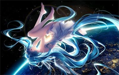
特效介绍
这是一款基于纯CSS3实现月光下飞舞的美丽精灵动画效果源码。星光闪耀的夜空中一轮明月高悬上空,月光下一个美丽的精灵煽动者翅膀、同时不时地扎着眼睛上下飞舞。整体动画效果栩栩如生。该动画效果采用纯css3实现,没有引入任何外部图形或js脚本元素,建议使用支持HTML5与css3效果较好的火狐(Firefox)或谷歌(Chrome)等浏览器预览本源码。
特效预览
![图片[1]-CSS3实现月光下飞舞的美丽精灵动画特效代码-QQ沐编程](https://www.qqmu.com/wp-content/uploads/2024/03/texiao_jingling.png)
特效代码
<!DOCTYPE html PUBLIC "-//W3C//DTD XHTML 1.0 Transitional//EN" "http://www.w3.org/TR/xhtml1/DTD/xhtml1-transitional.dtd">
<html xmlns="http://www.w3.org/1999/xhtml">
<head>
<meta http-equiv="Content-Type" content="text/html; charset=utf-8" />
<title>纯CSS3实现月光下飞舞的美丽精灵动画-QQ沐编程 </title>
<style>
body {
    background: black;
}
.content {
    position: relative;
    width: 800px;
    height: 600px;
    background: #02111C;
    margin: 90px auto;
}
.hada {
    position: absolute;
    width: 800px;
    height: 700px;
    -webkit-transform: scale(.5);
    transform: scale(.5);
    margin: 50px 0;
    -webkit-animation: volar9 3s alternate infinite;
    animation: volar9 3s alternate infinite;
}
.cara {
    position: relative;
    width: 102px;
    height: 102px;
    border-radius: 100%;
    background: #ffcc99;
    margin: 55px auto;
}
.ojo {
    position: absolute;
    width: 30px;
    height: 35px;
    border-radius: 30px 300px 30px 300px;
    -webkit-transform: rotate(-12deg);
    transform: rotate(-12deg);
    background: white;
    margin: 39px 9px;
    -webkit-animation: abre 3s alternate infinite;
    animation: abre 3s alternate infinite;
}
.ojo::before {
    content: "";
    display: block;
    width: 23px;
    height: 23px;
    border-radius: 100%;
    background: #339966;
    margin: 7px 5px
}
.ojo::after {
    content: "";
    display: block;
    width: 12px;
    height: 12px;
    border-radius: 100%;
    background: white;
    margin: -30px 14px
}
.ojo3 {
    position: absolute;
    width: 30px;
    height: 35px;
    border-radius: 30px 300px 30px 300px;
    -webkit-transform: rotate(-90deg);
    transform: rotate(-90deg);
    background: white;
    margin: 39px 65px;
    -webkit-animation: abre 3s alternate infinite;
    animation: abre 3s alternate infinite;
}
.ojo3::before {
    content: "";
    display: block;
    width: 23px;
    height: 23px;
    border-radius: 100%;
    background: #339966;
    margin: 7px 4px
}
.ojo3::after {
    content: "";
    display: block;
    width: 12px;
    height: 12px;
    border-radius: 100%;
    background: white;
    margin: -27px 16px
}
.nariz {
    position: absolute;
    width: 16px;
    height: 12px;
    border-radius: 21px 21px 0 0;
    border-top: 6px solid #f7bd73;
    margin: 73px 45px
}
.nariz::before {
    content: "";
    display: block;
    width: 21px;
    height: 12px;
    border-radius: 0 0 30px 30px;
    background: #ff6666;
    margin: 5px -3px;
}
.hair {
    position: absolute;
    width: 116px;
    height: 53px;
    border-radius: 112px 112px 0 0;
    background: #8f38b0;
    margin: -23px -6px;
}
.hair::before {
    content: "";
    display: block;
    width: 132px;
    height: 152px;
    border-radius: 100%;
    border-left: 25px solid #8f38b0;
    margin: 0px -7px
}
.hair::after {
    content: "";
    display: block;
    width: 132px;
    height: 152px;
    border-radius: 100%;
    border-right: 25px solid #8f38b0;
    margin: -152px -33px
}
.hair3 {
    position: absolute;
    width: 0;
    height: 0;
    border-left: 12px solid transparent;
    border-right: 12px solid transparent;
    border-top: 212px solid #8f38b0;
    margin: 77px -9px
}
.hair3::before {
    content: "";
    display: block;
    width: 0;
    height: 0;
    border-left: 7px solid transparent;
    border-right: 7px solid transparent;
    border-top: 192px solid #8f38b0;
    margin: -212px -12px
}
.hair4 {
    position: absolute;
    width: 0;
    height: 0;
    border-left: 12px solid transparent;
    border-right: 12px solid transparent;
    border-top: 212px solid #8f38b0;
    margin: 77px 90px
}
.hair4::before {
    content: "";
    display: block;
    width: 0;
    height: 0;
    border-left: 7px solid transparent;
    border-right: 7px solid transparent;
    border-top: 192px solid #8f38b0;
    margin: -192px -12px
}
.vincha {
    position: absolute;
    width: 109px;
    height: 12px;
    border-radius: 21px 21px 0 0;
    background: #cc0099;
    margin: 3px -3px;
}
.vincha::before {
    content: "";
    display: block;
    width: 21px;
    height: 21px;
    border-radius: 100%;
    border: 2px solid #339966;
    margin: -7px 41px;
}
.cuello {
    position: absolute;
    width: 16px;
    height: 21px;
    background: #ffcc99;
    margin: 155px 393px
}
.cuello::before {
    content: "";
    display: block;
    width: 96px;
    height: 21px;
    border-radius: 152px 152px 0 0;
    background: #ffcc99;
    margin: 21px -43px;
}
.cuello::after {
    content: "";
    display: block;
    width: 0;
    height: 0;
    border-left: 43px solid transparent;
    border-right: 43px solid transparent;
    border-top: 123px solid #cc0099;
    margin: -21px -37px
}
.vestido {
    position: absolute;
    width: 121px;
    height: 170px;
    border-top: 21px solid #cc0099;
    border-left: 21px solid transparent;
    border-right: 21px solid transparent;
    border-radius: 100px / 100px;
    -webkit-transform: rotate(-90deg);
    transform: rotate(-90deg);
    margin: 162px 412px
}
.vestido::before {
    content: "";
    display: block;
    width: 121px;
    height: 170px;
    border-top: 21px solid #cc0099;
    border-left: 21px solid transparent;
    border-right: 21px solid transparent;
    border-radius: 100px / 100px;
    -webkit-transform: rotate(180deg);
    transform: rotate(180deg);
    margin: -212px -21px
}
.falda {
    position: absolute;
    width: 0;
    height: 0;
    border-left: 65px solid transparent;
    border-right: 65px solid transparent;
    border-bottom: 132px solid #8f38b0;
    margin: 241px 333px
}
.brazos {
    position: absolute;
    width: 17px;
    height: 90px;
    border-radius: 100%;
    background: #ffcc99;
    -webkit-transform: rotate(45deg);
    transform: rotate(45deg);
    margin: 172px 312px
}
.brazos::before {
    content: "";
    display: block;
    width: 12px;
    height: 112px;
    border-radius: 100%;
    background: #ffcc99;
    margin: 50px 3px
}
.brazos::after {
    content: "";
    display: block;
    width: 7px;
    height: 21px;
    border-radius: 100%;
    background: #ffcc99;
    -webkit-transform: rotate(45deg);
    transform: rotate(45deg);
    margin: -60px 0px
}
.brazos3 {
    position: absolute;
    width: 17px;
    height: 90px;
    border-radius: 100%;
    background: #ffcc99;
    -webkit-transform: rotate(-45deg);
    transform: rotate(-45deg);
    margin: 170px 460px
}
.brazos3::before {
    content: "";
    display: block;
    width: 12px;
    height: 112px;
    border-radius: 100%;
    background: #ffcc99;
    margin: 50px 3px
}
.brazos3::after {
    content: "";
    display: block;
    width: 7px;
    height: 21px;
    border-radius: 100%;
    background: #ffcc99;
    -webkit-transform: rotate(-45deg);
    transform: rotate(-45deg);
    margin: -60px 10px
}
.varita {
    position: absolute;
    width: 5px;
    height: 90px;
    background: #333;
    -webkit-transform: rotate(-45deg);
    transform: rotate(-45deg);
    margin: 231px 207px
}
.legs {
    position: absolute;
    width: 35px;
    height: 152px;
    border-radius: 100%;
    background: #ffcc99;
    margin: 321px 340px;
    -webkit-transform: rotate(30deg);
    transform: rotate(30deg)
}
.legs::after {
    content: "";
    display: block;
    width: 21px;
    height: 50px;
    border-radius: 100%;
    background: #cc0099;
    margin: -155px 125px;
    -webkit-transform: rotate(-70deg);
    transform: rotate(-70deg)
}
.legs::before {
    content: "";
    display: block;
    width: 25px;
    height: 132px;
    border-radius: 100%;
    background: #ffcc99;
    margin: 105px 53px;
    -webkit-transform: rotate(-60deg);
    transform: rotate(-60deg)
}
.legs3 {
    position: absolute;
    width: 33px;
    height: 172px;
    border-radius: 100%;
    background: #ffcc99;
    margin: 321px 400px
}
.legs3::before {
    content: "";
    display: block;
    width: 23px;
    height: 172px;
    border-radius: 100%;
    background: #ffcc99;
    margin: 90px 5px
}
.legs3::after {
    content: "";
    display: block;
    width: 21px;
    height: 50px;
    border-radius: 100%;
    background: #cc0099;
    margin: -95px 4px
}
.alas {
    position: absolute;
    border-radius: 0px 412px 0px 412px;
    -webkit-transform: rotate(-201deg);
    transform: rotate(-201deg);
    background: rgba(153, 0, 255, .5);
    height: 291px;
    width: 185px;
    margin: 30px 231px;
    border: 1px solid rgba(153, 0, 255, .9);
    -webkit-animation: volar3 .1s alternate infinite;
    animation: volar3 .1s alternate infinite;
}
.alas::before {
    content: "";
    display: block;
    border-radius: 0px 412px 0px 412px;
    -webkit-transform: rotate(90deg);
    transform: rotate(90deg);
    background: rgba(255, 0, 153, 0.3);
    height: 291px;
    width: 185px;
    margin: -172px 70px;
    border: 1px solid rgba(255, 0, 153, 0.9);
}
.alas3 {
    position: absolute;
    border-radius: 412px 0px 412px 0px;
    -webkit-transform: rotate(201deg);
    transform: rotate(201deg);
    background: rgba(153, 0, 255, .5);
    height: 291px;
    width: 185px;
    margin: 30px 390px;
    border: 1px solid rgba(153, 0, 255, .9);
    -webkit-animation: volar7 .1s alternate infinite;
    animation: volar7 .1s alternate infinite;
}
.alas3::before {
    content: "";
    display: block;
    border-radius: 412px 0px 412px 0px;
    -webkit-transform: rotate(-90deg);
    transform: rotate(-90deg);
    background: rgba(255, 0, 153, 0.3);
    height: 291px;
    width: 185px;
    margin: -182px -50px;
    border: 1px solid rgba(255, 0, 153, 0.9);
}
.luna {
    position: absolute;
    width: 121px;
    height: 121px;
    border-radius: 100%;
    background: white;
    margin: 40px 340px;
    box-shadow: 0 0 90px #FFf;
}
.s1,
.s2,
.s3,
.s4,
.s5,
.s6 {
    position: absolute;
    width: 7px;
    height: 7px;
    border-radius: 100%;
    background: white;
    -webkit-animation: brillo 1.2s alternate infinite;
    animation: brillo 1.2s alternate infinite;
}
.s1 {
    margin: 121px 121px;
}
.s2 {
    margin: 121px 670px;
}
.s3 {
    margin: 12px 395px;
}
.s4 {
    margin: 450px 121px;
}
.s5 {
    margin: 450px 670px;
}
.s6 {
    margin: 570px 395px;
}
.star {
    position: absolute;
    width: 16px;
    height: 16px;
    border-radius: 100%;
    background: rgba(255, 255, 255, 1);
    background: -webkit-gradient(radial, center center, 0px, center center, 100%, color-stop(0%, rgba(255, 255, 255, 1)), color-stop(23%, rgba(255, 255, 255, 1)), color-stop(40%, rgba(115, 115, 115, 1)), color-stop(100%, rgba(115, 115, 115, 1)));
    background: -webkit-radial-gradient(center, ellipse cover, rgba(255, 255, 255, 1) 0%, rgba(255, 255, 255, 1) 23%, rgba(115, 115, 115, 1) 40%, rgba(115, 115, 115, 1) 100%);
    margin: 0px -5px;
    box-shadow: 1px 0 33px #FFf;
    -webkit-animation: enciende alternate infinite 12s;
    animation: enciende alternate infinite 12s;
}
.star1 {
    position: absolute;
    width: 35px;
    height: 3px;
    background: #0ce3fd;
    margin: 7px -8px;
    -webkit-animation: enciende6 .3s alternate infinite;
    animation: enciende6 .3s alternate infinite;
}
.star2 {
    position: absolute;
    width: 3px;
    height: 35px;
    background: #ff6666;
    margin: -9px 8px;
    -webkit-animation: enciende6 .3s alternate infinite;
    animation: enciende6 .3s alternate infinite;
}
.star3 {
    position: absolute;
    width: 33px;
    height: 3px;
    background: #00c3fb;
    margin: 8px -8px;
    -webkit-transform: rotate(45deg);
    transform: rotate(45deg);
    -webkit-animation: enciende6 .5s alternate infinite;
    animation: enciende6 .5s alternate infinite;
}
.star4 {
    position: absolute;
    width: 35px;
    height: 3px;
    background: #fa4b70;
    margin: 7px -8px;
    -webkit-transform: rotate(-45deg);
    transform: rotate(-45deg);
    -webkit-animation: enciende6 .5 alternate infinite;
    animation: enciende6 .5 alternate infinite;
}
@-webkit-keyframes volar3 {
    0% {
        -webkit-transform: rotate(-201deg) scale(.5);
        transform: rotate(-201deg) scale(.5);
    }
    50% {
        -webkit-transform: rotate(-205deg) scale(.5);
        transform: rotate(-205deg) scale(.5);
        opacity: .7;
    }
    100% {
        -webkit-transform: rotate(-201deg)scale(.5);
        transform: rotate(-201deg)scale(.5);
    }
}
@keyframes volar3 {
    0% {
        -webkit-transform: rotate(-201deg) scale(.5);
        transform: rotate(-201deg) scale(.5);
    }
    50% {
        -webkit-transform: rotate(-205deg) scale(.5);
        transform: rotate(-205deg) scale(.5);
        opacity: .7;
    }
    100% {
        -webkit-transform: rotate(-201deg)scale(.5);
        transform: rotate(-201deg)scale(.5);
    }
}
@-webkit-keyframes volar7 {
    0% {
        -webkit-transform: rotate(201deg) scale(.5);
        transform: rotate(201deg) scale(.5);
    }
    50% {
        -webkit-transform: rotate(205deg) scale(.5);
        transform: rotate(205deg) scale(.5);
        opacity: .7
    }
    100% {
        -webkit-transform: rotate(201deg) scale(.5);
        transform: rotate(201deg) scale(.5);
    }
}
@keyframes volar7 {
    0% {
        -webkit-transform: rotate(201deg) scale(.5);
        transform: rotate(201deg) scale(.5);
    }
    50% {
        -webkit-transform: rotate(205deg) scale(.5);
        transform: rotate(205deg) scale(.5);
        opacity: .7
    }
    100% {
        -webkit-transform: rotate(201deg) scale(.5);
        transform: rotate(201deg) scale(.5);
    }
}
@-webkit-keyframes volar9 {
    0% {
        -webkit-transform: translatey(-53px) scale(.5);
        transform: translatey(-53px) scale(.5);
    }
    50% {
        -webkit-transform: translatey(-12px) scale(.5);
        transform: translatey(-12px) scale(.5);
    }
    100% {
        -webkit-transform: translatey(-53px) scale(.5);
        transform: translatey(-53px) scale(.5);
    }
}
@keyframes volar9 {
    0% {
        -webkit-transform: translatey(-53px) scale(.5);
        transform: translatey(-53px) scale(.5);
    }
    50% {
        -webkit-transform: translatey(-12px) scale(.5);
        transform: translatey(-12px) scale(.5);
    }
    100% {
        -webkit-transform: translatey(-53px) scale(.5);
        transform: translatey(-53px) scale(.5);
    }
}
@-webkit-keyframes brillo {
    0% {
        box-shadow: 0 0 3px 3px rgba(255, 255, 255, .3);
    }
    50% {
        box-shadow: 0 0 3px 3px rgba(255, 255, 255, .5);
    }
    100% {
        box-shadow: 0 0 3px 3px rgba(255, 255, 255, .3);
    }
}
@keyframes brillo {
    0% {
        box-shadow: 0 0 3px 3px rgba(255, 255, 255, .3);
    }
    50% {
        box-shadow: 0 0 3px 3px rgba(255, 255, 255, .5);
    }
    100% {
        box-shadow: 0 0 3px 3px rgba(255, 255, 255, .3);
    }
}
@-webkit-keyframes enciende3 {
    0%, 25%, 35% {
        opacity: 0.1;
    }
    49%,
    50% {
        opacity: .5;
    }
    60%,
    70%,
    90%,
    100% {
        opacity: 1;
    }
}
@keyframes enciende3 {
    0%, 25%, 35% {
        opacity: 0.1;
    }
    49%,
    50% {
        opacity: .5;
    }
    60%,
    70%,
    90%,
    100% {
        opacity: 1;
    }
}
@-webkit-keyframes enciende6 {
    0% {
        opacity: 0.3;
    }
    50% {
        opacity: 0.7;
    }
    100% {
        opacity: 1;
    }
}
@keyframes enciende6 {
    0% {
        opacity: 0.3;
    }
    50% {
        opacity: 0.7;
    }
    100% {
        opacity: 1;
    }
}
@-webkit-keyframes abre {
    0%, 25% {
        opacity: 1
    }
    35% {
        opacity: 0
    }
    50% {
        opacity: 1;
    }
    100% {
        opacity: 1
    }
}
@keyframes abre {
    0%, 25% {
        opacity: 1
    }
    35% {
        opacity: 0
    }
    50% {
        opacity: 1;
    }
    100% {
        opacity: 1
    }
}
</style>
</head>
<body>
<div class="content">
    <div class="luna"></div>
    <div class="stars">
        <span class="s1"></span>
        <span class="s2"></span>
        <span class="s3"></span>
        <span class="s4"></span>
        <span class="s5"></span>
        <span class="s6"></span>
    </div>
    <div class="hada">
        <div class="alas"></div>
        <div class="alas3"></div>
        <div class="cuello"></div>
        <div class="legs"></div>
        <div class="legs3"></div>
        <div class="falda"></div>
        <div class="vestido"></div>
        <div class="brazos"></div>
        <div class="brazos3"></div>
        <div class="varita">
            <div class="star">
                <span class="star1"></span>
                <span class="star2"></span>
                <span class="star3"></span>
                <span class="star4"></span>
            </div>
        </div>
        <div class="cara">
            <div class="ojo"></div>
            <div class="ojo3"></div>
            <div class="nariz"></div>
            <div class="hair"></div>
            <div class="hair3"></div>
            <div class="hair4"></div>
            <div class="vincha"></div>
        </div>
    </div>
</div>
</body>
</html>
© 版权声明
本站资源来自互联网收集,仅供用于学习和交流,请勿用于商业用途。如有侵权、不妥之处,请联系站长并出示版权证明以便删除。敬请谅解!
THE END