
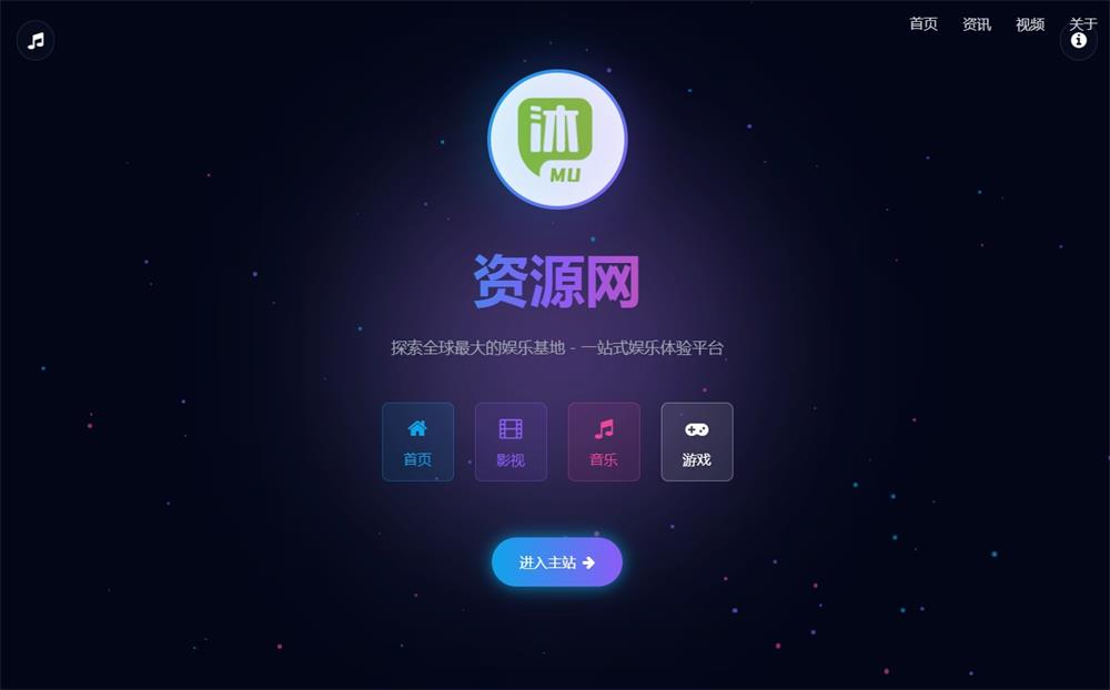
这款深蓝动态粒子URL跳转页面HTML源码,将技术与美学完美融合,为网站链接跳转提供了专业级解决方案。无论是广告跳转、外部链接引导,还是安全验证场景,这款设计都能显著提升用户体验。
设计亮点解析
1. 沉浸式深空视觉体验
- 采用深邃的渐变背景:
linear-gradient(135deg, #0f0c29, #302b63, #24243e)营造宇宙空间感 - 动态粒子系统:50个随机生成的粒子在背景中浮动,增强页面活力
- 磨砂玻璃效果卡片:
backdrop-filter: blur(10px)实现高级质感UI
2. 炫酷加载动画
.circle {
  background-image: linear-gradient(0deg, rgb(47,102,255), ...);
  animation: rotate 1.5s linear infinite;
  box-shadow: 0 0 50px rgba(153,64,255,0.5);
}
霓虹渐变色圆环搭配旋转动画,配合中央倒计时数字,创造强烈的视觉焦点
3. 专业安全提示系统
- 醒目安全图标:
<i class="fas fa-shield-alt">增强可信度 - 多层次警示信息:包含目标网址展示、风险提示和取消跳转按钮
- 自适应布局:完美兼容移动设备(@media查询优化)
核心功能实现
1. 智能URL参数解析
function getTargetUrl() {
  const fullQuery = window.location.href.split('?')[1] || '';
  const params = new URLSearchParams(fullQuery);
  return params.get('url') || "https://www.qqmu.com";
}支持从URL参数动态获取跳转目标,如:redirect.html?url=https://target-site.com
2. 倒计时跳转机制
function time() {
  let i = 3;
  const timer = setInterval(() => {
    if (i <= 0) window.location.href = getTargetUrl();
    sec.innerHTML = i-- + "s";
  }, 1000);
}
3秒可视化倒计时,给予用户充分决策时间
3. 粒子背景生成算法
for (let i = 0; i < 50; i++) {
  particle.style.width = `${Math.random()*5+2}px`;
  particle.style.animation = `float ${Math.random()*20+10}s infinite`;
}
创建大小、运动速度各异的粒子群,形成自然流动效果
应用场景示例
- 广告联盟跳转
?url=广告链接实现美观的广告中转页面,降低跳出率 - 外部链接安全警告
提示用户即将离开本站,增强安全意识 - 下载页面中转
提供3秒倒计时让用户确认下载操作 - 会员专享链接验证
跳转前显示会员专属提示信息
使用指南
- 部署HTML文件到服务器
- 在需要跳转处使用格式:
<a href="redirect.html?url=目标网址">安全跳转</a> - 自定义元素:
- 修改
linear-gradient调整主色调 - 更新底部版权信息
- 调整
particleCount控制粒子密度
<!-- 示例:修改渐变背景 -->
background: linear-gradient(135deg, #1a0a47, #3f2b95, #2d2758);
技术栈优势
- 现代化CSS3:flex布局、渐变、滤镜效果
- 矢量图标:Font Awesome 6提供精致图标
- 轻量级JS:原生JavaScript实现核心功能
- 响应式设计:完美适配移动设备
这款跳转页面源码不仅解决了技术需求,更通过精致的视觉设计提升了品牌专业形象。动态粒子与霓虹光效的组合,让原本功能性的跳转页面成为用户体验的加分项。3秒的安全缓冲期既符合网络安全规范,又给予用户充分的操作自主权,是商业网站的理想选择。
提示:实际部署时建议添加Google Analytics跟踪代码,收集跳转转化数据以优化用户体验
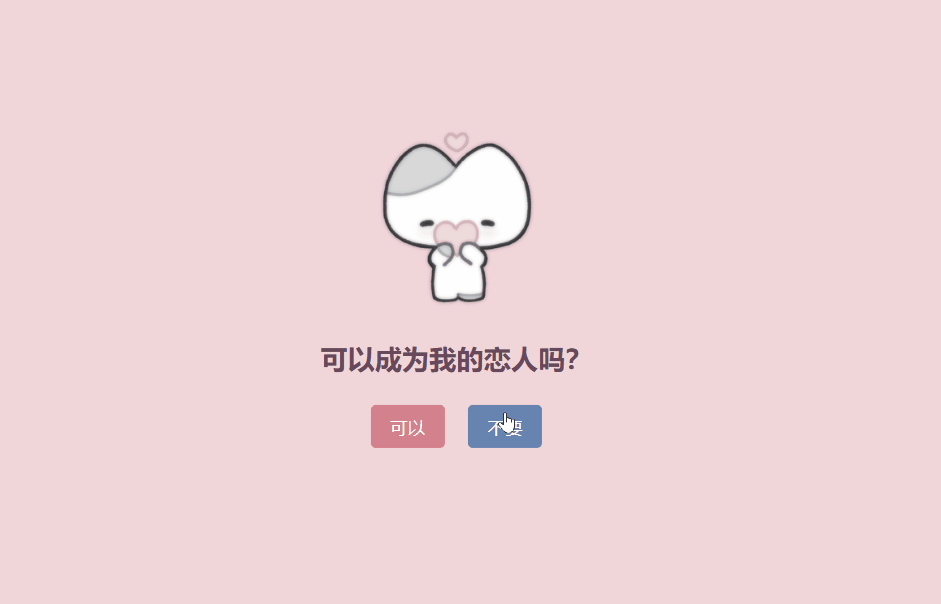
效果截图
![图片[1]-深蓝动态粒子URL跳转页面:高颜值安全跳转解决方案](https://www.qqmu.com/wp-content/uploads/2025/06/go-url.jpg)
源码下载
将下面代码可以放到一个html或者PHP空白文件里面,然后放到服务器对应的位置就可以用了,,比如·放到go.php里面,浏览器访问xxx/go.php/?url=目标网址 就可以了
<!DOCTYPE html>
<html>
<head>
    <meta charset="utf-8" />
    <meta name="viewport" content="width=device-width, initial-scale=1, shrink-to-fit=no">
    <link rel="stylesheet" href="https://cdnjs.cloudflare.com/ajax/libs/font-awesome/6.4.0/css/all.min.css">
    <link rel="stylesheet" href="https://cdn.bootcdn.net/ajax/libs/twitter-bootstrap/4.3.1/css/bootstrap.min.css">
    <title>安全跳转页面</title>
    <style>
        * {
            padding: 0;
            margin: 0;
            box-sizing: border-box;
        }

        body {
            width: 100%;
            height: 100vh;
            background: linear-gradient(135deg, #0f0c29, #302b63, #24243e);
            font-family: 'Segoe UI', Tahoma, Geneva, Verdana, sans-serif;
            overflow: hidden;
        }

        .main {
            position: relative;
            width: 100%;
            height: 100%;
            display: flex;
            flex-direction: column;
            justify-content: center;
            align-items: center;
            padding: 20px;
            z-index: 10;
        }

        .card {
            background: rgba(255, 255, 255, 0.05);
            backdrop-filter: blur(10px);
            border-radius: 20px;
            border: 1px solid rgba(255, 255, 255, 0.1);
            padding: 30px;
            max-width: 500px;
            width: 100%;
            text-align: center;
            box-shadow: 0 15px 35px rgba(0, 0, 0, 0.2);
            margin-bottom: 30px;
        }

        .card h2 {
            color: #fff;
            margin-bottom: 25px;
            font-weight: 600;
            font-size: 28px;
            text-shadow: 0 0 10px rgba(255, 255, 255, 0.3);
        }

        .loader-container {
            position: relative;
            margin: 30px 0;
        }

        .circle {
            display: flex;
            justify-content: center;
            align-items: center;
            width: 200px;
            height: 200px;
            margin: 0 auto;
            background-image: linear-gradient(0deg,
            rgb(47, 102, 255),
            rgb(153, 64, 255) 30%,
            rgb(238, 55, 255) 60%,
            rgb(255, 0, 76) 100%);
            border-radius: 50%;
            animation: rotate 1.5s linear infinite;
            box-shadow: 0 0 50px rgba(153, 64, 255, 0.5);
        }

        .circle::before {
            content: "";
            position: absolute;
            width: 200px;
            height: 200px;
            background-image: linear-gradient(0deg,
            rgb(47, 102, 255),
            rgb(153, 64, 255) 30%,
            rgb(238, 55, 255) 60%,
            rgb(255, 0, 76) 100%);
            border-radius: 50%;
            filter: blur(35px);
            opacity: 0.7;
        }

        .circle::after {
            content: "";
            position: absolute;
            width: 150px;
            height: 150px;
            background: rgba(15, 12, 41, 0.8);
            border-radius: 50%;
        }

        .countdown {
            position: absolute;
            top: 50%;
            left: 50%;
            transform: translate(-50%, -50%);
            color: #fff;
            font-size: 42px;
            font-weight: 700;
            z-index: 20;
            text-shadow: 0 0 10px rgba(255, 255, 255, 0.5);
        }

        .info-box {
            background: rgba(0, 0, 0, 0.2);
            border-radius: 12px;
            padding: 15px;
            margin: 20px 0;
        }

        .info-box p {
            color: #fff;
            margin: 8px 0;
            font-size: 16px;
        }

        .info-box .url {
            color: #6cff6c;
            font-weight: 500;
            word-break: break-all;
            font-size: 14px;
        }

        .security-info {
            display: flex;
            justify-content: center;
            align-items: center;
            margin-top: 20px;
            color: #ffc107;
        }

        .security-info i {
            margin-right: 10px;
            font-size: 20px;
        }

        .tips {
            color: rgba(255, 255, 255, 0.8);
            font-size: 14px;
            margin-top: 15px;
            line-height: 1.6;
        }

        .btn-cancel {
            background: rgba(255, 255, 255, 0.1);
            border: 1px solid rgba(255, 255, 255, 0.2);
            color: #fff;
            padding: 10px 25px;
            border-radius: 50px;
            font-weight: 500;
            margin-top: 20px;
            transition: all 0.3s ease;
            cursor: pointer;
        }

        .btn-cancel:hover {
            background: rgba(255, 255, 255, 0.2);
            transform: translateY(-2px);
        }

        .footer {
            color: rgba(255, 255, 255, 0.6);
            text-align: center;
            font-size: 14px;
            margin-top: 20px;
        }

        @keyframes rotate {
            0% {
                transform: rotate(0deg);
            }
            100% {
                transform: rotate(360deg);
            }
        }

        .particles {
            position: absolute;
            top: 0;
            left: 0;
            width: 100%;
            height: 100%;
            z-index: 1;
        }

        .particle {
            position: absolute;
            border-radius: 50%;
            background: rgba(255, 255, 255, 0.1);
        }

        @media (max-width: 576px) {
            .card {
                padding: 20px;
            }

            .circle {
                width: 150px;
                height: 150px;
            }

            .circle::before {
                width: 150px;
                height: 150px;
            }

            .circle::after {
                width: 110px;
                height: 110px;
            }

            .countdown {
                font-size: 32px;
            }
        }
    </style>
</head>
<body onload="time()">
    <div class="particles" id="particles"></div>

    <div class="main">
        <div class="card">
            <h2><i class="fas fa-shield-alt"></i> 安全跳转页面</h2>

            <div class="loader-container">
                <div class="circle"></div>
                <div class="countdown" id="second">3s</div>
            </div>

            <div class="info-box">
                <p><i class="fas fa-exclamation-triangle"></i> 网络交易需谨慎,正在跳转到目标网址</p>
                <p>目标网址:<span id="targetUrl" class="url">正在获取...</span></p>
            </div>

            <div class="security-info">
                <i class="fas fa-lock"></i>
                <span>安全检测通过,此跳转经过安全验证</span>
            </div>

            <p class="tips">
                请注意:该跳转由第三方网站提供,请仔细核对网址,确保访问的是您信任的网站。
                如有疑问,请勿继续访问。
            </p>

            <button class="btn-cancel" onclick="cancelRedirect()">
                <i class="fas fa-ban"></i> 取消跳转
            </button>
        </div>

        <div class="footer">
            <p>QQ沐编程 © 2023 | 保护您的网络安全</p>
        </div>
    </div>

    <script>
        // 创建粒子背景
        function createParticles() {
            const container = document.getElementById('particles');
            const particleCount = 50;

            for (let i = 0; i < particleCount; i++) {
                const particle = document.createElement('div');
                particle.classList.add('particle');

                // 随机大小和位置
                const size = Math.random() * 5 + 2;
                const posX = Math.random() * 100;
                const posY = Math.random() * 100;

                particle.style.width = `${size}px`;
                particle.style.height = `${size}px`;
                particle.style.left = `${posX}%`;
                particle.style.top = `${posY}%`;

                // 随机动画
                const animationDuration = Math.random() * 20 + 10;
                particle.style.animation = `float ${animationDuration}s linear infinite`;

                container.appendChild(particle);
            }
        }

        // 修复URL获取函数,正确处理#后缀
        function getTargetUrl() {
            // 获取完整的查询字符串(包括#后面的部分)
            const fullQuery = window.location.href.split('?')[1] || '';

            // 正确处理多个参数和包含#的情况
            const params = new URLSearchParams(fullQuery);
            const urlParam = params.get('url');

            // 如果URL参数存在,返回它;否则返回默认URL
            return urlParam || "https://www.qqmu.com";
        }

        // 显示目标URL
        function displayTargetUrl() {
            const targetUrl = getTargetUrl();
            document.getElementById('targetUrl').textContent = targetUrl;
        }

        // 倒计时和跳转
        function time() {
            displayTargetUrl();

            const sec = document.getElementById("second");
            let i = 3; // 设置定时时间

            const timer = setInterval(function() {
                i--;
                sec.innerHTML = i + "s";

                if (i <= 0) {
                    clearInterval(timer);
                    window.location.href = getTargetUrl();
                }
            }, 1000);
        }


        // 初始化粒子效果
        createParticles();
    </script>
</body>
</html>
© 版权声明
本站资源来自互联网收集,仅供用于学习和交流,请勿用于商业用途。如有侵权、不妥之处,请联系站长并出示版权证明以便删除。敬请谅解!
THE END